Up and until recently I have viewed the development of a mono image simply as a conversion of a colour image at the post-processing stage. Sometimes the conversion of an image that did not ‘work’ in colour.
The approach of noteworthy professional photographers experienced in mono work, such as Andy Beel FRPS, is to make the decision for the development of a mono image at the taking stage, that is, in the camera. They are able to envisage the image in mono in their mind at that stage; this can only come with experience.
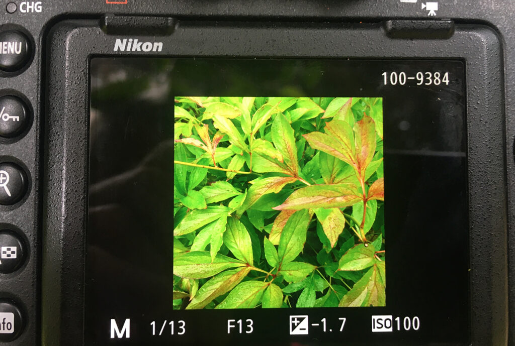
The picture above represents the colour image in camera of a garden plant. I liked the pattern of the leaves and the different tones. I have purposely used the square format as this could be more appropriate for such a composition. Question is, could it work better in mono?
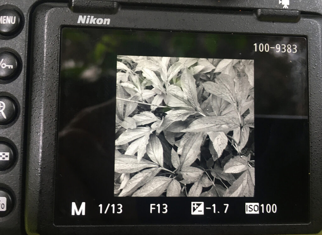
Above shows the image in mono in camera. With the camera on a tripod this is achieved by switching from colour to mono and which I prefer instead of colour.
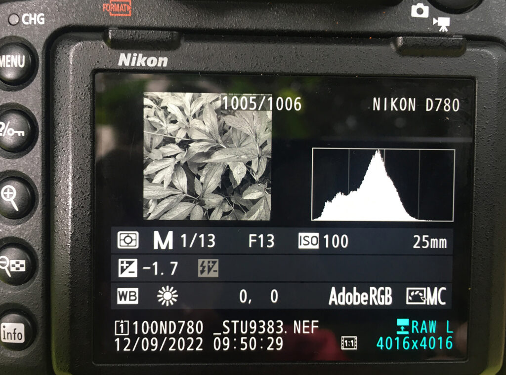
Now I check the histogram on the back of the camera. Does it have sufficient range of tones for mono? I could increase the exposure by moving the histogram further to the right. However, overall, I am happy with the composition and histogram.
In any mono image there is no reason why there should not be areas of pure white or pure black. Can this be envisaged at the taking stage? This style depends on the artistic skill and confidence of the photographer; there no rules! – only what you want to show.
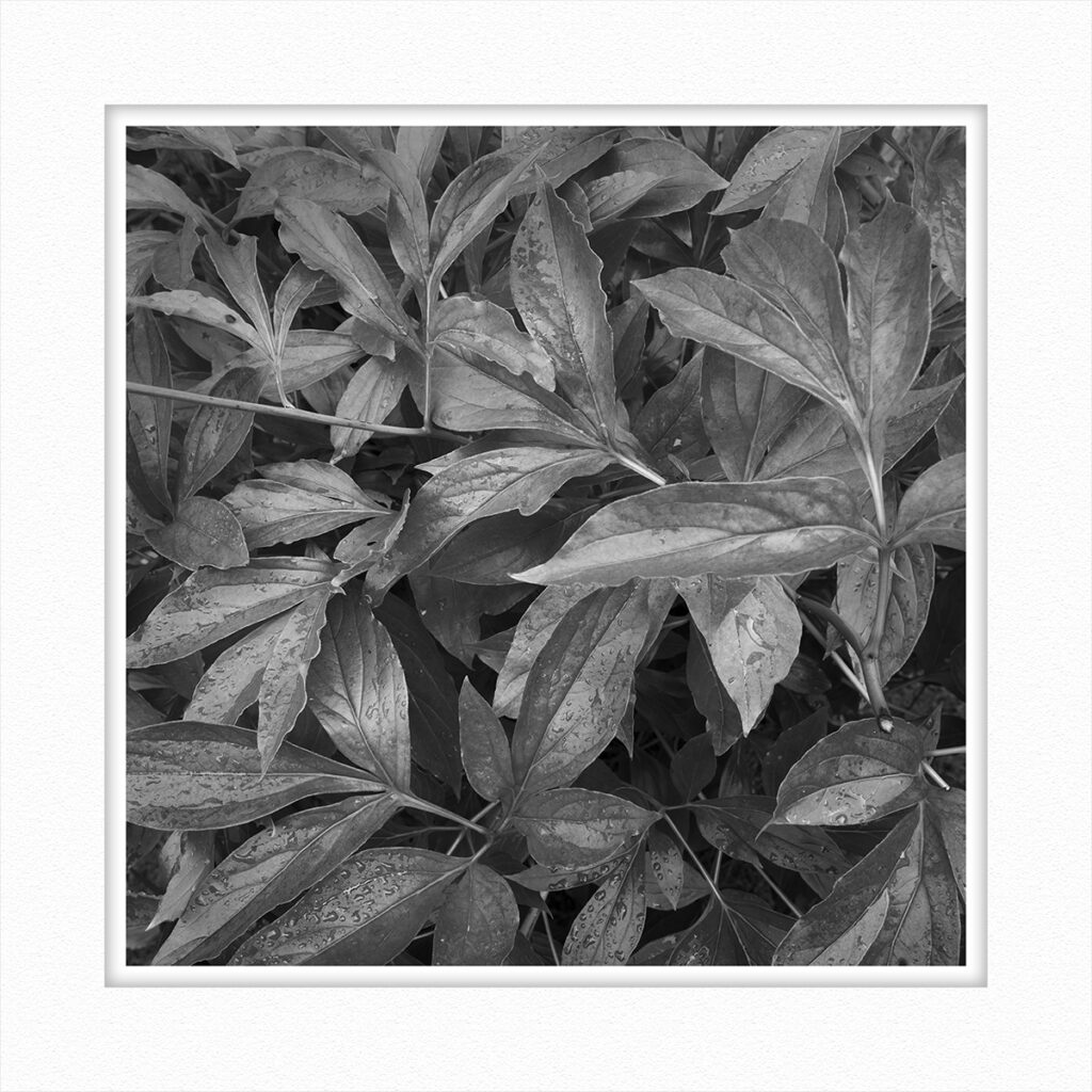
Above is the final fully developed image, does it work better in mono?
The following are a few examples of mono images that I have developed.
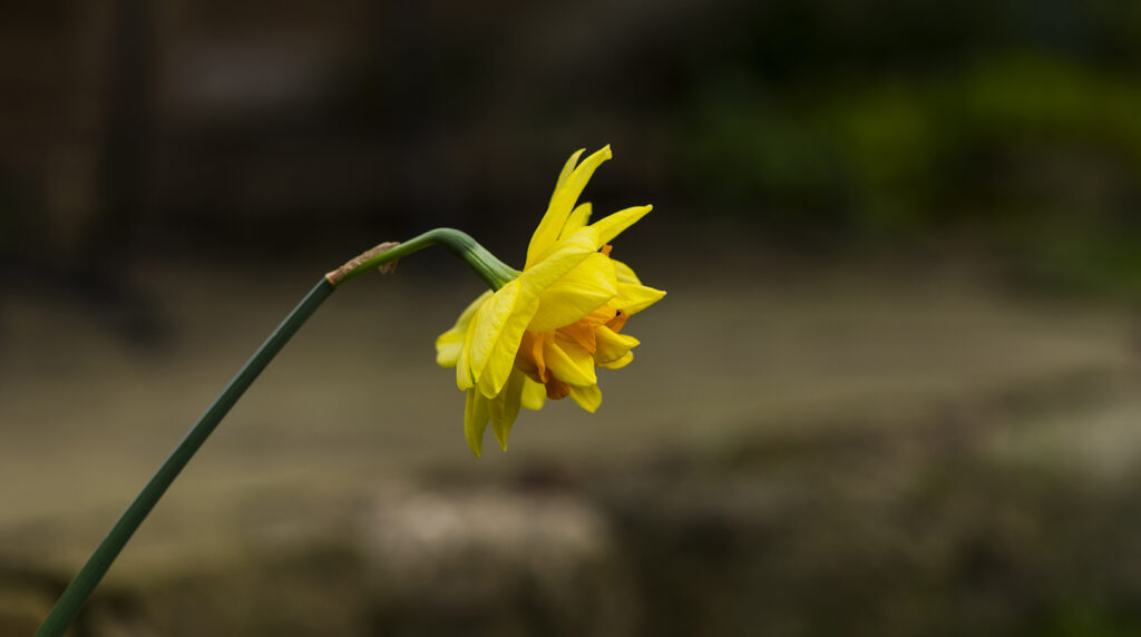
Above is the original colour photograph of a daffodil with its distinctive yellow petals. I liked the structure and shape of the petals and so developed the following image.
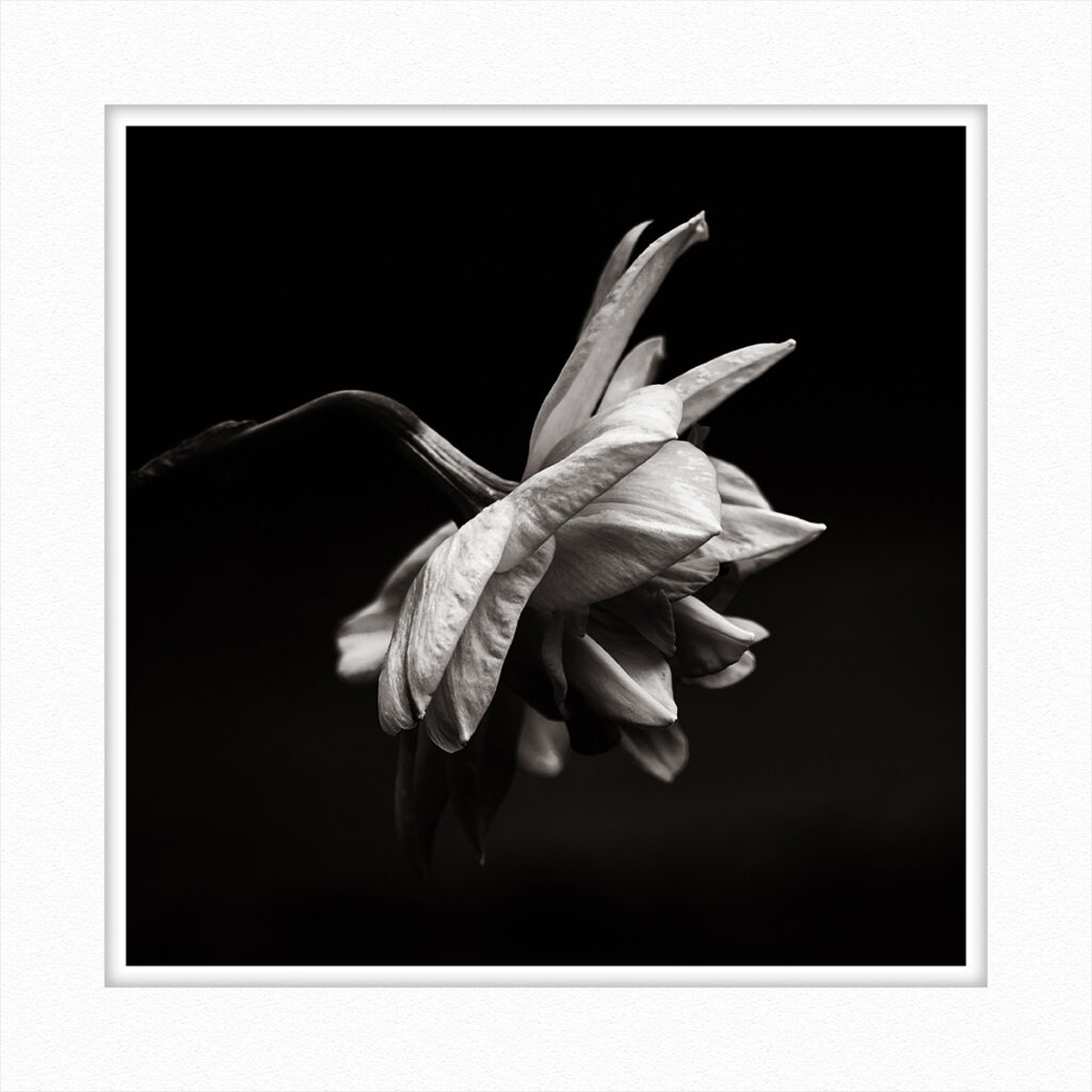
The original image has been severely cropped and again I adopted the square format and added a slight sepia tone to create interest – does it work better? At the taking stage I had envisaged providing negative space to the right of the flower. At one of our Mono Group meetings, at which we show images for comment, it was suggested that a square format might be better, which I think it does.
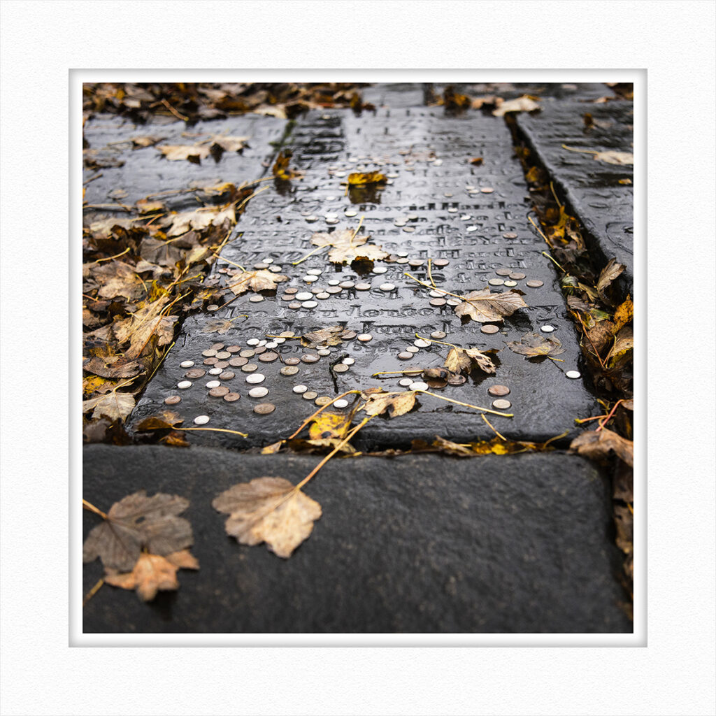
Although the above image is in colour, there isn’t a wide a range of colours and is almost mono.
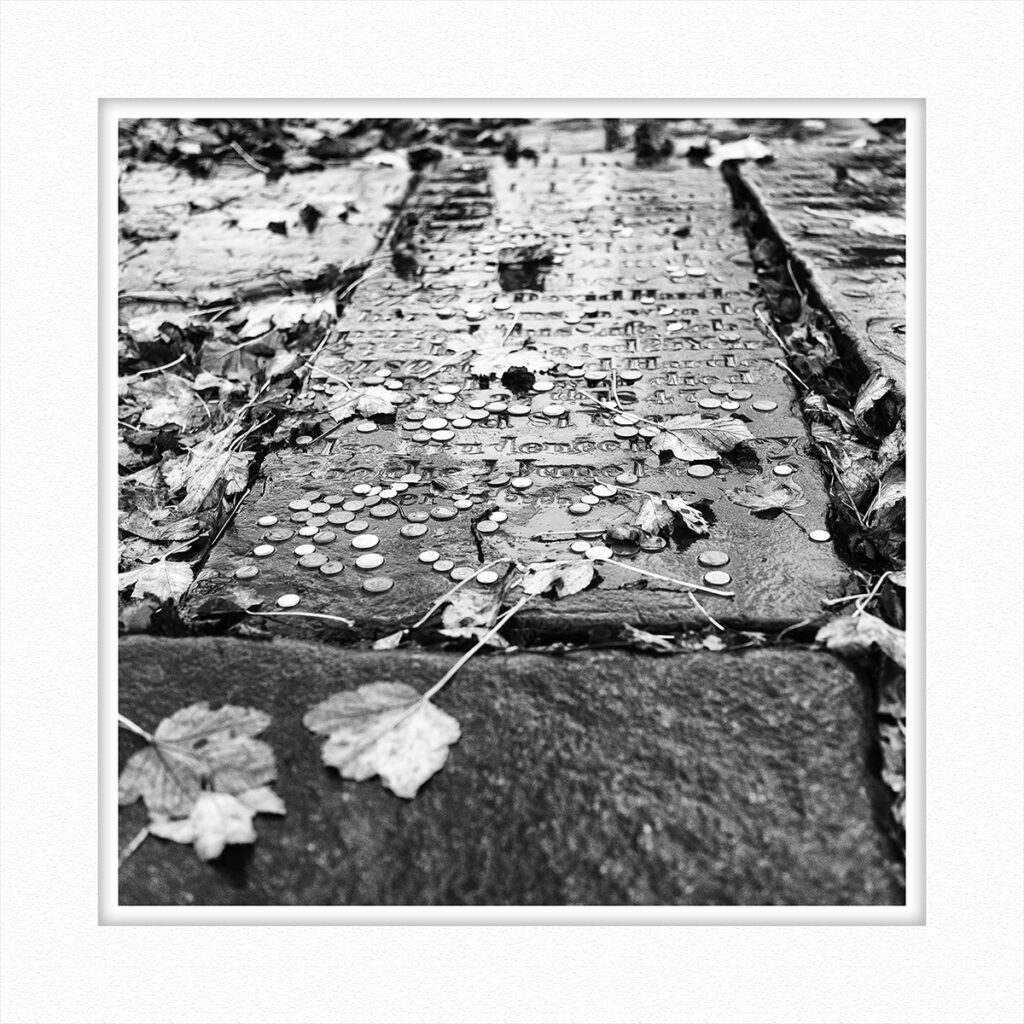
Although the true mono version does work but for this particular image I think that it works best in colour, despite it being virtually in mono.
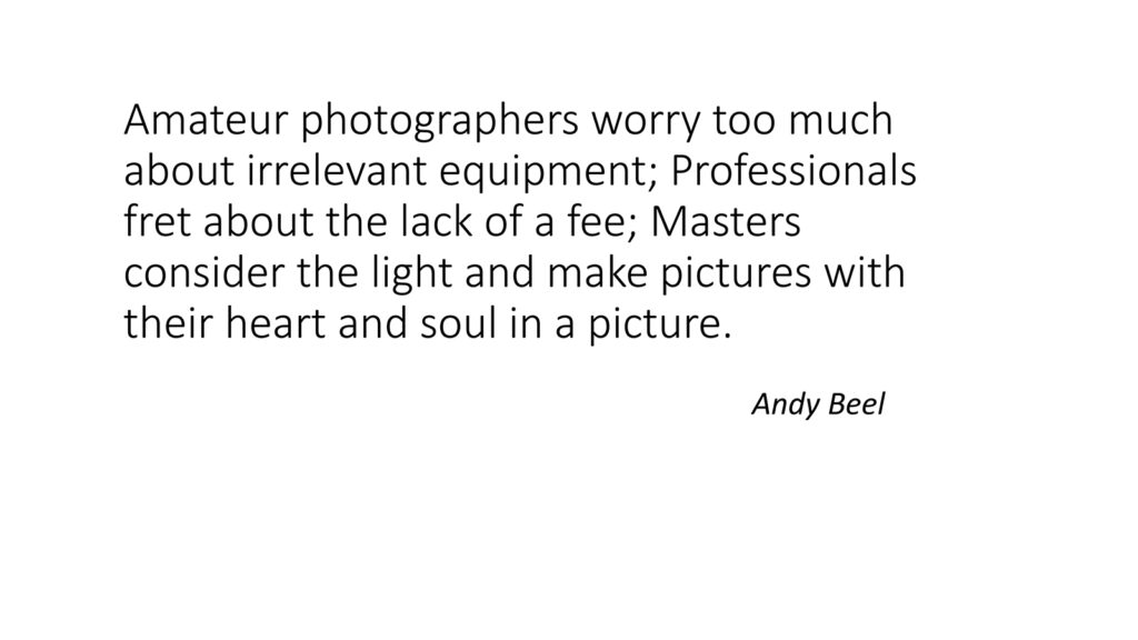
This statement by Andy Beel is very relevant to photography today and is included for interest.
Thank you.
Stu Thompson
You can see more of Stu Thompson’s photos in his personal gallery on this link
